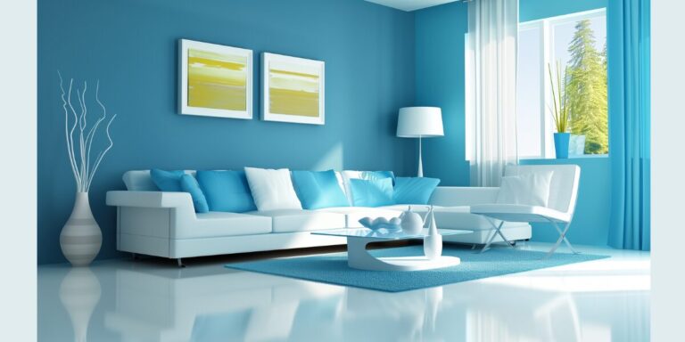
Welcome to our ultimate guide on mastering the split complementary color scheme in interior design. If you’ve ever wondered how to create a visually stunning space that balances contrast and harmony, you’re in the right place.
Key Takeaways:
- What is a Split Complementary Color Scheme? It’s a color scheme involving one base color and the two colors adjacent to its direct complement on the color wheel.
- Why Use It? It offers a unique balance of contrast and harmony, making spaces vibrant yet cohesive.
- How to Apply It? Choose your base color, identify its complement, then select the two adjacent colors to that complement. Use the 60-30-10 rule to balance your colors.
Whether you’re a seasoned interior designer, an aspiring decorator, or a homeowner looking to spruce up your space, understanding color schemes—particularly split complementary ones—is a game-changer. In this guide, we’ll delve deep into what split complementary colors are, how to identify them on the color wheel, and how they can transform your space.
We’ll provide real-life examples, practical tips, and common mistakes to avoid. Plus, we’ll answer some frequently asked questions about split complementary color schemes. By the end of this article, you’ll be equipped with the knowledge and inspiration to create visually pleasing spaces that strike the perfect balance of contrast and harmony.
Understanding Split Complementary Color Scheme
As a professional interior designer, I’ve always been fascinated by the power of color. It’s one of the most transformative elements in a room—capable of setting the mood, influencing our emotions, and even altering our perception of space. One of the most intriguing, yet often misunderstood, concepts in color theory is the split complementary color scheme.
Definition and Basics of Split Complementary Colors
A split complementary color scheme is a little twist on the traditional complementary color scheme.
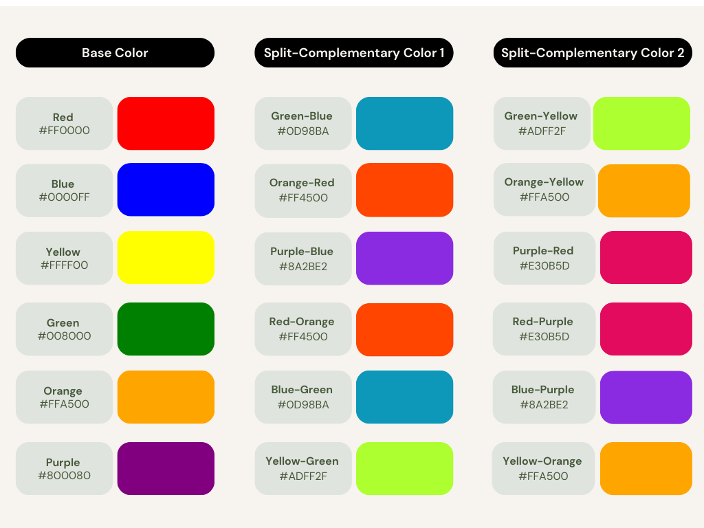
Instead of using two colors directly opposite each other on the color wheel, a split complementary scheme involves one base color and the two colors adjacent to its direct complement.
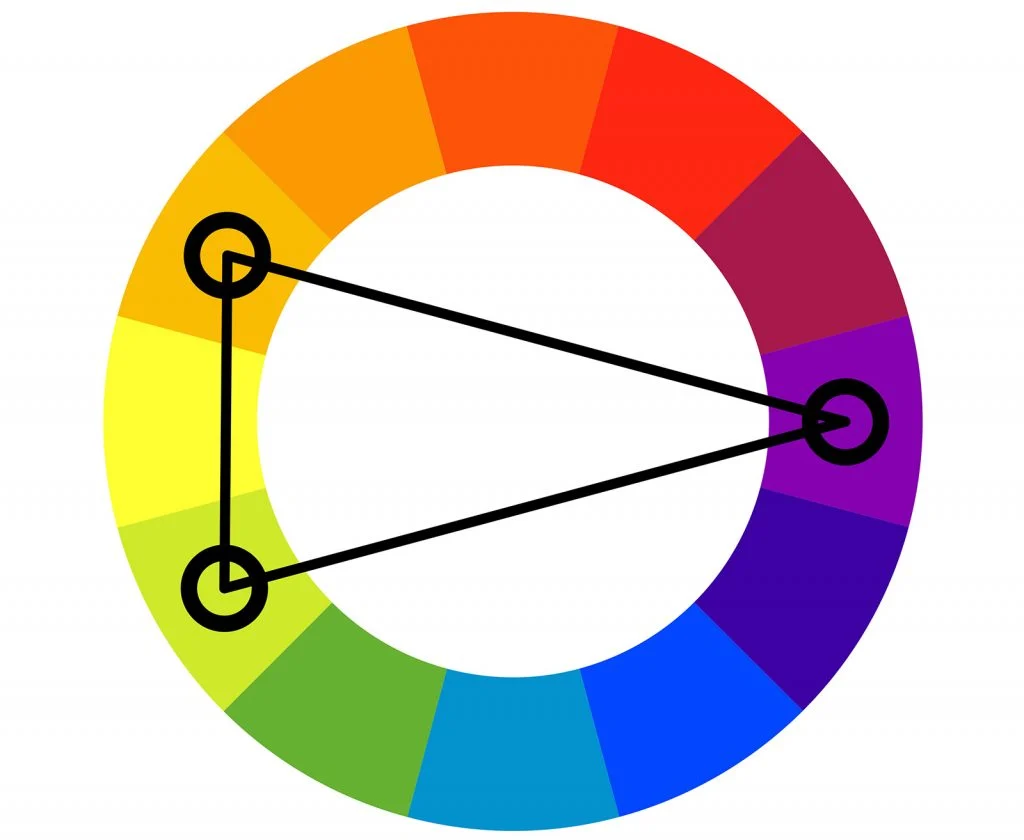
For example:
- If your base color is blue, instead of pairing it with its direct complement (orange), you pair it with the colors adjacent to orange—yellow-orange and red-orange. This provides the contrast of complementary colors but with a softer, more harmonious feel.
The Role of Contrast in Split Complementary Color Schemes
Contrast plays a crucial role in a split complementary color scheme. It’s what makes this scheme visually exciting and dynamic. The base color creates a strong visual contrast with the adjacent colors of its complement, adding depth and dimension to the space.
However, because the two secondary colors are close to each other on the color wheel, they also share a certain harmony. This balance between contrast and harmony is the beauty of a split complementary color scheme. It offers a vibrant, lively look without being too jarring or overwhelming.
The Color Wheel and Split Complementary Colors
The color wheel is our trusted guide in the world of color theory. It’s a circular diagram of colors arranged by their chromatic relationship. It’s where we can visually understand the concept of primary, secondary, and tertiary colors and how they relate to each other.
Identifying Split Complementary Colors on the Color Wheel
To identify split complementary colors on the color wheel:
- Choose a base color. This could be any color that fits your design vision.
- Find its direct complement. This is the color directly opposite your base color on the wheel.
- Select the two colors adjacent to the complement. These two colors, along with your base color, form your split complementary color scheme.
Example:
- Base Color: Blue
- Direct Complement: Orange
- Split Complements: Yellow-Orange and Red-Orange
The Role of Primary and Secondary Colors
Understanding the role of primary and secondary colors is key to mastering split complementary color schemes.
- Primary Colors: Red, Blue, Yellow
- Secondary Colors: Green, Orange, Purple (created by mixing primary colors)
When using a split complementary color scheme, your base color can be primary or secondary. The two colors you pair with it will typically be a mix of primary and secondary colors. This combination allows for rich contrast while maintaining a sense of harmony and balance in your design.
Examples of Split Complementary Color Schemes in Interiors
Seeing is believing, isn’t it? Let’s take a look at some examples of split complementary color schemes in real-life interiors.
These examples will help illustrate how this color scheme can be applied to create visually appealing and harmonious spaces.
Residential Interior Examples: Split Complementary Room Designs
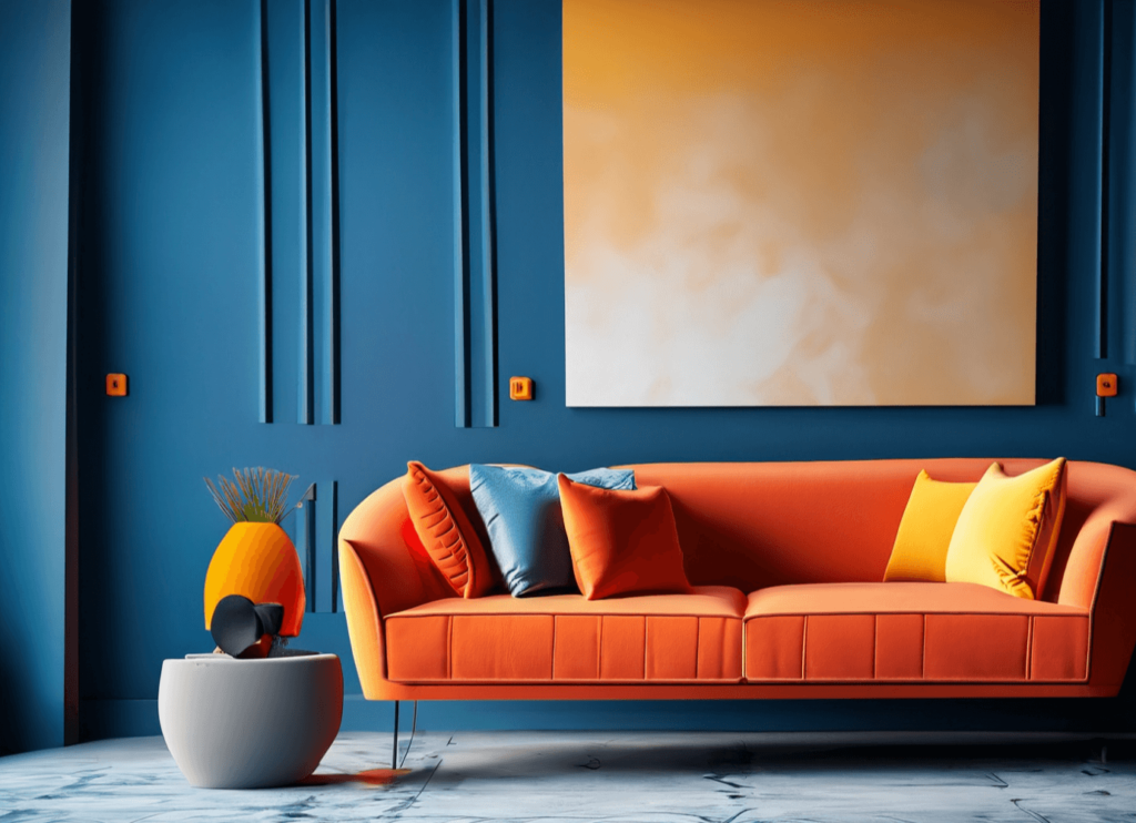
Example 1: Vibrant Living Room
- Base Color: Deep Blue (used on walls)
- Split Complements: Red-Orange and Yellow-Orange (used in furniture and accessories)
- Result: A dynamic and engaging space that’s vibrant yet harmonious.
Commercial Interior Examples: Split Complementary Colors in Action
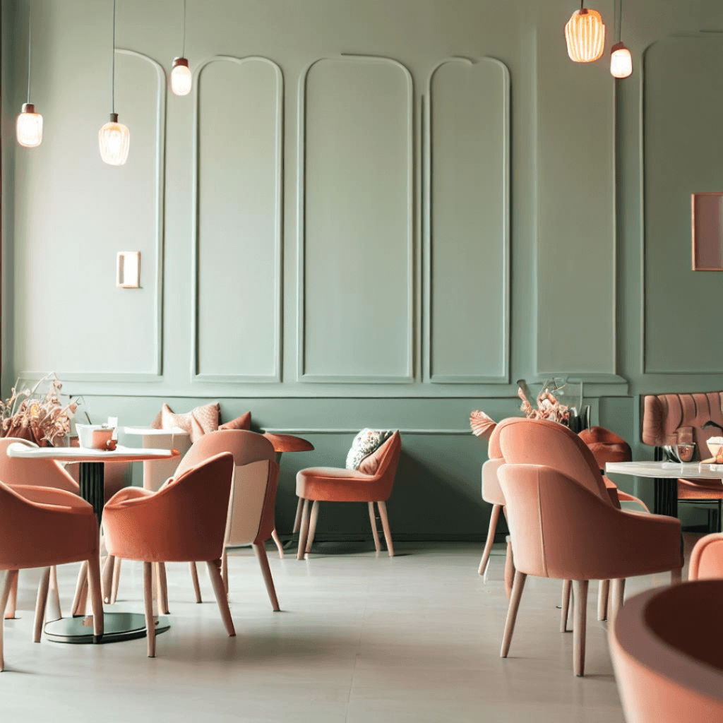
Example: Trendy Café
- Base Color: Sage Green (used on walls)
- Split Complements: Soft Pink and Vibrant Orange (used in chairs and light fixtures)
- Result: An energetic and harmonious space perfect for lively conversations and delicious coffee.
How to Use a Split Complementary Color Scheme in Your Design
Now that we’ve explored what a split complementary color scheme is and seen some examples, let’s talk about how you can use this color scheme in your designs.
Choosing Your Base Color and Complementary Color Pairs
- Select Your Base Color: This is the dominant color in your design and sets the overall mood.
- Identify the Direct Complement: Find the color directly opposite your base color on the color wheel.
- Choose the Adjacent Colors: Select the two colors adjacent to the direct complement. These will be your split complements.
Tip:
Use your base color for about 60% of the room, one split complement for 30%, and the other for 10%. This is known as the 60-30-10 rule.
Balancing Your Split Complementary Colors in the Space
Balance is key when using a split complementary color scheme. Here’s how to achieve it:
- Dominant Color (60%): Use your base color on walls, floors, or large pieces of furniture.
- Secondary Color (30%): Incorporate one split complement in upholstery, curtains, or rugs.
- Accent Color (10%): Use the other split complement for accessories like cushions, lamps, or artwork.
This is called the 60 -30-10 rule you can read more here on this.
Remember: These are guidelines. Feel free to adjust the proportions to suit your style and the specific needs of your space.
Benefits of Using Split Complementary Color Schemes
Visual Interest and Balance
A split complementary color scheme creates visual interest through contrast while maintaining balance and harmony. The combination of three colors adds depth and dimension to your space, making it both dynamic and cohesive.
Versatility in Interior Design
This color scheme is highly versatile:
Personalization: Offers more options for mixing and matching, allowing for a unique and personalized design.
Adaptable to Various Styles: From minimalist to maximalist designs.
Suitable for Different Spaces: Works in residential and commercial settings.
Common Mistakes to Avoid When Using Split Complementary Colors
Overwhelming Use of Colors
Avoid using too much of each color, which can make the space feel chaotic.
- Solution: Stick to the 60-30-10 rule to ensure a balanced and harmonious look.
Neglecting Neutrals
Don’t forget about neutrals like white, black, gray, and beige.
- Solution: Use neutrals for elements like walls, floors, or large pieces of furniture to balance the vibrant colors.
Ignoring the Room’s Function and Lighting
Different colors evoke different moods.
- Solution: Choose a base color that suits the room’s function and consider the lighting conditions, as colors can look different under various lighting.
The Psychology of Split Complementary Colors
Color is more than just a visual element. It has the power to evoke emotions, influence our mood, and even affect our behavior.
This is where the psychology of color comes into play. Understanding the psychological effects of colors can help us make more informed design decisions.
Let’s explore the psychology of split complementary colors and how they can impact the feel of a space.
Emotional Responses to Split Complementary Colors
Every color evokes a different emotional response. For example, red is often associated with energy and passion, while blue can evoke feelings of calm and tranquility.
In a split complementary color scheme, the combination of three colors can create a complex and nuanced emotional landscape.
The base color sets the overall mood of the space.
The two complementary colors, by providing contrast, add depth and complexity to this mood.
For instance, a room with a blue base color and orange-yellow and red-orange accents can feel both calming (due to the blue) and energizing (due to the warm accents).
Color Psychology in Interior Design: The Impact of Split Complementary Colors
In interior design, understanding color psychology can help us create spaces that not only look good but also feel good.
A split complementary color scheme, with its balance of harmony and contrast, can create a dynamic and engaging atmosphere.
The harmony between the two complementary colors can create a sense of balance and stability, making the space feel comfortable and inviting.
The contrast with the base color adds an element of excitement and vitality, keeping the space from feeling too predictable or boring.
The psychology of split complementary colors is a fascinating aspect of color theory that can add depth and richness to your designs.
By understanding the emotional responses that different colors can evoke, you can use a split complementary color scheme to create spaces that are not only visually appealing but also emotionally resonant.
Comparing Split Complementary with Other Color Schemes
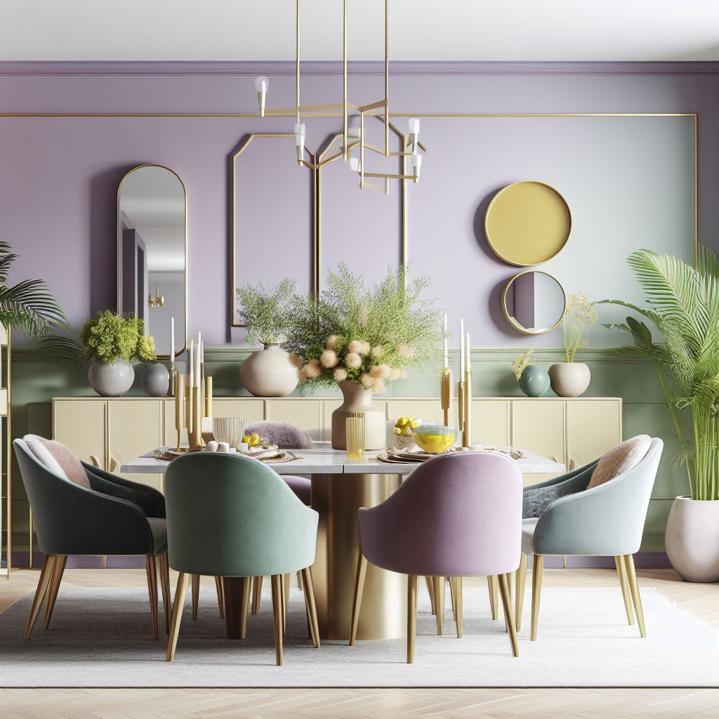
Every color scheme has its own unique characteristics and effects, and understanding these can help you choose the right scheme for your design project.
Let’s compare split complementary color schemes with some other popular color schemes: complementary, analogous, and triadic.
Split Complementary vs. Complementary Color Schemes
A complementary color scheme uses two colors that are directly opposite each other on the color wheel, such as blue and orange or red and green.
This scheme offers high contrast, creating a vibrant and dynamic look. However, it can also be quite intense and needs to be balanced carefully to avoid clashing.
On the other hand, a split-complementary color scheme uses a base color and the two colors adjacent to its complement.
This scheme still offers contrast, but it’s less intense than a complementary scheme, resulting in a more harmonious and balanced look.
Split Complementary vs. Analogous and Triadic Color Schemes
An analogous color scheme uses colors that are next to each other on the color wheel, such as blue, blue-green, and green.
This scheme is very harmonious and calming, but it lacks the contrast and dynamism of a split complementary scheme.
A triadic color scheme uses three colors that are evenly spaced around the color wheel, such as red, yellow, and blue.
This scheme is vibrant and balanced, but it can be quite bold and needs to be used carefully to avoid overwhelming the space.
In comparison, a split complementary scheme offers a unique balance of contrast and harmony.
It’s less intense than a complementary or triadic scheme but more dynamic than an analogous scheme, making it a versatile and appealing choice for many design projects.
While each color scheme has its own strengths and effects, a split-complementary color scheme offers a unique combination of contrast and harmony that can create visually appealing and balanced designs.
Choosing the Right Colors for Your Space
Choosing the right colors for your space is a crucial step in any design project. The colors you choose can influence the mood, perception, and functionality of the space.
When working with a split-complementary color scheme, there are a few key factors to consider.
Considering Room Function and Size in Split Complementary Color Scheme
The function of the room should be a major factor in your color choice.
For instance, a bedroom might benefit from calming colors like blues or greens, while a home office might need energizing colors like yellows or oranges.
The size of the room is another important consideration. Light colors can make a small room feel larger and more open, while dark colors can make a large room feel cozier and more intimate.
The Impact of Lighting on Split Complementary Colors
Lighting can significantly impact how colors appear.
Natural light will show the truest color, while incandescent lighting can bring out warm tones, and fluorescent lighting can enhance cool tones.
When choosing your colors, consider the lighting conditions in the room. You might want to test your colors at different times of the day and under different lighting conditions to see how they look.
Choosing the right colors for your space involves considering the function and size of the room, as well as the lighting conditions.
With these factors in mind, you can choose a split complementary color scheme that enhances the beauty and functionality of your space.
Incorporating Patterns and Textures in Split Complementary Color Scheme
While color is a crucial element in interior design, it’s not the only one.
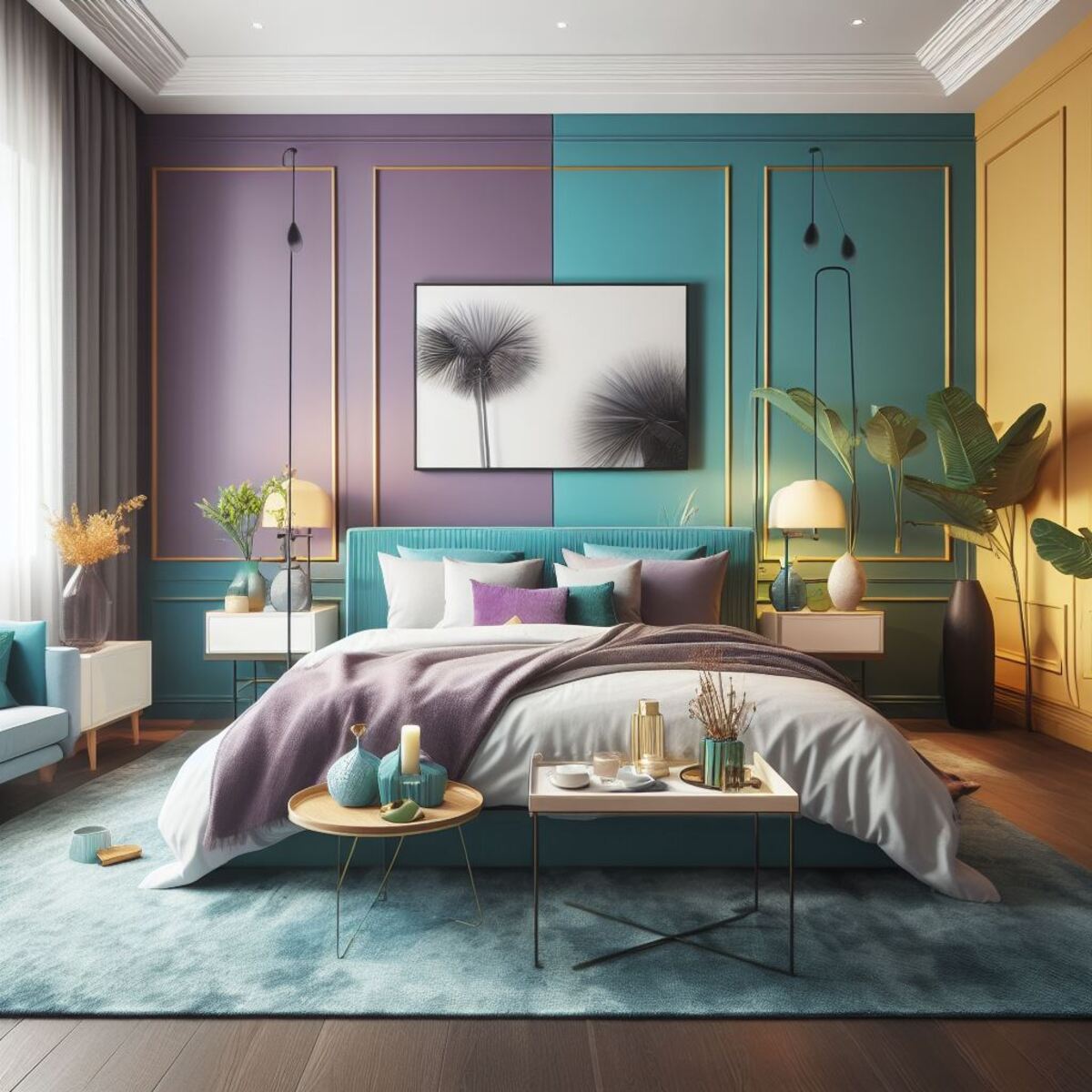
Patterns and textures can add depth, interest, and personality to your space. When combined with a split complementary color scheme, they can create a truly dynamic and engaging design.
Using Patterns in Split Complementary Color Scheme
Patterns can be a great way to incorporate your split complementary colors.
For instance, a rug or a set of cushions in a geometric pattern that includes your base color and its split complements can tie the room together and reinforce your color scheme.
When using patterns, consider the scale and complexity of the pattern.
Large-scale, complex patterns can be bold and may compete with the vibrant colors in a split complementary scheme. On the other hand, small-scale, simple patterns can add interest without overwhelming the space.
The Role of Textures in Split Complementary Color Scheme
Textures, like patterns, can add depth and interest to your design. They can also influence how we perceive colors.
For instance, a rough texture can make a color seem darker, while a smooth texture can make it look lighter.
In a split complementary color scheme, consider using different textures for each color. This can help to differentiate the colors and add an extra layer of depth to your design.
For example, you might choose a soft, plush fabric in your base color, a smooth, glossy material in one of your complementary colors, and a rough, natural texture in the other.
Incorporating patterns and textures into your split complementary color scheme can create a rich, layered, and visually interesting design.
By considering the scale and complexity of patterns and the type and feel of textures, you can enhance the impact of your color scheme and create a truly engaging space.
Case Study: Successful Split Complementary Interior Designs
Real-world examples can provide valuable insights into how split complementary color schemes work in practice.
Let’s look at a couple of case studies where these color schemes have been successfully implemented in interior designs.
Case Study 1: Vibrant Living Room Design
Our first case study involves a living room design where the designer chose a bold red as the base color. The split complements chosen were green-blue and green-yellow.
The red was used on the walls, creating a warm and energetic backdrop for the room. The green-blue was incorporated into the upholstery of the sofa and armchairs, providing a cool contrast to the red. The green-yellow was used sparingly in accessories like cushions and vases, adding a touch of brightness and freshness to the room.
The result was a vibrant and dynamic living room that was also balanced and inviting. The split complementary color scheme allowed the designer to create a strong visual impact while maintaining harmony and cohesion in the room.
Case Study 2: Calming Bedroom Design
Our second case study is a bedroom design where the designer chose a calming blue as the base color. The split complements were orange-red and orange-yellow.
The blue was used on the walls and bed linens, creating a serene and restful atmosphere. The orange-red was incorporated through a rug and throw pillows, adding warmth and contrast to the cool blue. The orange-yellow was used in small accents like a bedside lamp and artwork, adding a touch of brightness and energy to the room.
The result was a bedroom that was both calming and visually interesting. The split complementary color scheme allowed the designer to create a harmonious yet dynamic space, perfect for relaxation and rejuvenation.
These case studies illustrate how split complementary color schemes can be used effectively in interior design. They show that with careful color selection and thoughtful application, this color scheme can create vibrant, balanced, and visually appealing spaces.
Follow us on Pinterest
FAQ
How do I draw a split complementary color scheme?
Choose a base color on the color wheel, find its direct complement, then select the two colors on either side of it. These three colors form your split complementary scheme.
What is the split complementary color scheme?
It’s a color scheme involving one base color and the two colors adjacent to its direct complement on the color wheel, offering a balance of contrast and harmony.
What is the difference between a complementary and a split complementary color scheme?
A complementary scheme uses two colors directly opposite each other on the color wheel, while a split complementary scheme uses a base color and the two colors adjacent to its direct complement.
What would be the third color in a split complementary scheme with red-purple and red-orange?
The third color in this split complementary scheme would be yellow-green, which is the color directly across from red-purple on the color wheel.
How can I use a split complementary color scheme in my home?
Start by choosing a dominant base color for walls or large furniture. Use the two split complementary colors for accents like cushions, rugs, or wall art to create balance and contrast.
Is a split complementary color scheme suitable for any room?
Yes, it’s versatile and can work in any room. The key is to balance the colors effectively according to the room’s function and lighting.
Can I use patterns and textures in a split complementary color scheme?
Absolutely! Patterns and textures add depth and interest. Just ensure they complement your color scheme and don’t overwhelm the space.


